Romantic sparks occur between Jason and Dee, lead dancers of a west London based street dance crew. However when it doesnt work out between them, the whole group is forced to be split into two and their dreams to compete in the westside dance off are shattered -Logline
The film follows a group of West London teenagers who aspire to be the next big urban dance group in the entertainment industry. The group is lead by couple and lead dancers, Jason and Dee however when problems start to rise between their relationship, their group soon starts to fall apart too. Dee and Jason both come from different backgrounds and have very different personalities. After Dee finds out Jason has turned to drugs she decides to call it a day with him and likewise, the group do too and decide to go two separate ways. Dees way and Jasons way. Nor Jason nor Dee want to let the others down therefore they agree to continue dancing but this time, with their newly and minimized dance crews. Neither groups turn out to be successful but soon, despite the hatred and troubles between Dee and Jason, they decide their dream to dance and make their friends happy was more important so they give it another go at running the dance crew and preparations for the biggest event of their lives soon begin. But how will Dee and Jasons relationship end up?
"2 very different people. 1 dream. 1 love. 1 crew."- Tagline
Wednesday, 13 November 2013
Tuesday, 12 November 2013
Film poster & trailer analysis
Hey blogger!
For this weeks task we have been asked to do an analysis on a poster and trailer and seeing as Christmas is on its way, i have decided to go for a very festive movie "Elf".
Here is the trailer:

For this weeks task we have been asked to do an analysis on a poster and trailer and seeing as Christmas is on its way, i have decided to go for a very festive movie "Elf".
Here is the trailer:
Genre:
Adventure/Festive
Narrative/Plot:
As a baby, Buddy was looked after by an orphanage. However on Christmas he was accidentally stowed away into santas sack and ended up in the north pole where he then grew up. 30 years on, hes an adult human still living in the north pole, thinking he one of santas elves. However he gets informed by the elves that he is a human and Santa allows him to return to his birthplace, New York so he can seek who he really is and find his birth farther, Walter Hobbs. Walter didn't have a clue that buddy was born so when he turned up on his door step, he was overwhelmed but not pleased. Meanwhile, Buddy experiences the delights and joys of the human culture and new york city as it was all new to him. When Buddys and walters relationship as farther and son escalates and interferes with his Job, Walter is forced to rethink about what matters to him most. His son or his job?
Characters:
Buddy, Walter Hobbs, elves, Santa, etc
Iconography:
In the film trailer you see that a repetior of elements and typical iconography has been shown. Firstly, you see that in the trailer it is snowing, it starts off in the elves workshop at the north pole and Santa and the elves are featured. Then when Buddy arrives in new york, you notice that the city has been covered in christmas decorations and there is alot of christmas cheer and spirit. Also, may i add, that New York is quite a typical city for a Christmas movie to be set in as most are based there.
Setting:
It is obviously set during the christmas season of december and its time period is typically the modern day noughties. Also as i said above, it is first set at the north pole for the beginning of the trailer & movie then its soon based in the city of new york.

How are images used to attract the audience?
In this movie poster, you see that the letter "L" in the word "elf" has been replaced by an image of a man dressed as a elf. This is significant and very clever of the creators as it suggests that the rather tall and odd looking man dressed in a festive elf costume, may be claiming to be an elf when clearly he looks nothing like what people sterotypically believe and elf looks like. Also, the rather tall looking "elf" suggests to the audience that there may be something wrong with the him as elves are usually extremely short, however because this elf is tall,the audience would imply that this man is unusual and it would make them want to watch the film to find out more. Finally, this idea of incorporating the image of the protagonist and the title works well because the colours and patterns on the costume are very similar to the colour and pattern of the letters.
How are words used to give the audience info about the film?
The tagline/slogan is "This holiday, discover your inner elf". Again, this has been cleverly put together by the creators as it uses a famous phrase, "discover you inner self" but instead the word "self" has been replaced by the word "elf" so it fits with the festive Christmas theme. It could suggest to the audience that the film is all about the elf finding out who he really is and it implies that he may want to stop hiding under a costume and show his true colours and self. Also the main actors names have been placed at the bottom so the audience will recognize the names and are more likely to watch the film.
Iconography that tells you the genre:
-The colours green and red are festive colours
-The actor is wearing an elf costume
-The serif font looks old and festive
Ana.
Wednesday, 16 October 2013

Current progress of my magazine cover :)
This my magazine cover for assiment 1 so far...
A cover image still awaits!

A cover image still awaits!

Thursday, 3 October 2013
Magazine cover analysis.
Hey blogger,
Wednesdays lesson was the official start to our first piece of coursework; assignment 1. In this post i am going to be analyzing a magazine cover of my choice.
Wednesdays lesson was the official start to our first piece of coursework; assignment 1. In this post i am going to be analyzing a magazine cover of my choice.
 |
Unfortunately i started one in lesson which i forgot to save therefore i have to redo the whole thing! This time however, ive decided to go for a different magazine. At first i started an analysis on the "mach of the day" magazine however i am now changing my choice to a more urban and classy mag called "GQ" which is based on mens fashion and lifestyle.
Friday, 27 September 2013
Demographics- Audience profile.
Hey Blogger!
Today was another successful lesson where we learnt about audience demographic profiles in more depth. A demographic profile is a key media and also business tool that identifies the characteristics of what a target market is interested in when companies want to promote a new product. The characteristics in a profile include; age, gender, race/ethnicity, job, social class and location. More specific categories in a demographic profile seek info on a customers purchasing habits (as shown en the below picture) e.g Clothing brands, restaurants, etc.
For this task, I have decided to go abit vintage and "old-school". I have chosen to do my audience profile on the old classic, Pacman. Yes, i know its old but its certainly legendary!

For this task, i have written about who atari aimed pacman at, during the time it was released however in the explaination i have explained in more depth as there have been many versions of the game. However all the pictures that relate to the target market are quite modern and "now" and relate to who would buy pacman today.
Age: I have made the age range 12-25 because at the time when the original 1980s arcade game of pacman was released, the game was aimed mostly at kids and teens as it wasnt popular for people over the age of 25 to play video games, however after pacman was released on gameboy which was in the early 2000's more and more of the older generation got into the habit of playing them, therefore if someone was likely to buy packman today (2013), it will most likely be someone even over the age of 25 as its an old classic. However from the original release, it would be from the age of 12-25.
Gender: Again, at the time it was released it would have originally been aimed mostly at males, approximately 70%, therefore only 30% female as obviously it would have been quite surprising in the 1980's for a woman to be playing video games. But in the 2000's i think it would have been a split between the two. However if someone was to buy the game now i personally think, the main gender buying it would be female as men tend to go for more action games nowadays. But from the original Atari perspective the main gender percentage would be 70% male & 30% female.
Race/Ethnicity: The main race and ethnicity would have mainly been from the UK as pacman was one of the first video games and the Uk, England in particular, was a extremely developed nation. Also the theme of the game would mainly appeal to people with a retro & vintage taste, which then again would probably be from a white racial background as england was the home of the vintage/retro "style" and pacman is classic & quite retro game. However now, the game has extended and become worldwide therefore it would have a variety of ethnicity's playing it. But originally Atari may have aimed it at people from the UK at the time.
Job/Social class: From the original atari prespective, the game would have been aimed at the richer and more educated people who could afford it as video/arcade games where mainly for people who had higher standards. However, today ANYONE with ANY class standard can play it and its even available FREE online! But then again, if you look at it from the original POV then it would be mainly, B-A.
Location: This relates to the race and ethnicity point. Pacman was a game mainly aimed at the people who were richer and preferably from the UK, therefore the main location where the target marget is would be the city. However, now it would even be popular in the countryside as the game is legendary, even the older generation would be highly failiar with it. But then again, from the original 1980s point of veiw it would be mainly people from the city.
Ana.
Photoshop- Typography.
Hi Blogger,
This week we had another new and "exciting" task to complete using Photoshop. It wasn't particularly as fun as other tasks we've done but I wouldn't say it was boring either!
For this task, we were given a set of words in which we had to change the fonts to make them match the theme and connotation of each word. We completed the whole task using Photoshop.
The words were:
- Harmony,
- Globe,
- Personality,
- Elastic,
- Emperor
- Mistake,
- Falling,
- Radiation,
- Brittle,
- Relax,
- Madness

My personal favorite is the font of the word "mistake" because it really matches the theme and it looks quite unique.
For the extension we had to create our own company logo/poster using one of the chosen fonts from the previous task. I chose the "harmony" font but put a twist in it and filled certain areas with colour.
My company was a funfair popcorn stall. It has a traditional, old-fashioned vibe to it and by adding a splash of colour to it, automatically it looks more vibrant and modern.

Overall, I think both the pieces of work I have completed using Photoshop, have been successful. However i could have made some of the word more sophisticated.
Ana :)
Friday, 20 September 2013
Camera shots storyboard.
Hello Blogger,
In today's media lesson we were given a more practical task to do. First we studied and defined all the different camera shots and angles, then later on we had to go outside and create a story board with our group using all the different camera angles & shots.
Here is what we came up with:


Shot type: Establishing shot.
This photo allows viewers to see where the main story is going to be set. It also shows, although the picture isn't clear enough for you to see, all the characters involved in the scene standing in certain positions and postures to intrigue the viewers.
Shot type: Long shot.
This shot allows the viewers to see the characters from head to toe and also the setting surrounding them. In this picture you see a couple, where the boy is offering his girlfriend his jacket.
Shot type: Over the shoulder shot.
This shot lets you see and visualize someones point of view. In this image you see a big and quite scary figure watching the couple from a distance. Judging by his posture, you can infer that he is angry as his shoulders look quite tensed. Also in the distance it shows a girl, (the boys ex girlfriend) watching the couple angrily.
Shot type: Medium Shot.
This type of photo allows you to see the subject/s from head to waist and some of the location in the background. In this shot you see the girl looking DIRECTLY at the camera. Her facial expression looks very scared. This, therefore, creates climax and makes the viewer want to carry on watching.
Shot type: Extreme close-up.
This shot focuses on one aspect in particular and emphasizes a shot with extreme detail. This image shows the face of the girls brother (They guy in the over the shoulder shot). His facial expression is a frown, along with an evil smirk. Additionally, you know hes going to cause trouble.
Shot type: Medium shot.
In this picture you see the girls brother "beating up" her boyfriend and shoving him against a wall aggressively. In the background you also see the boys ex girlfriend who was frowning at him and his girlfriend, but this time shes laughing at the boy being attacked.

Shot type: Over the shoulder shot.
In this shot you see the girl in the above picture filming the fight. This shows that she is having revenge to pay back the boy for what did to her.
Shot type: Close up.
This shot focuses mainly on someones face to show emotional reaction. In this image you see how the boy is left hurt and upset after his girlfriends brother beats him up. His facial expression makes him look as if he has been attacked badly.
Thursday, 12 September 2013
Photoshop: Fruit bowl task.
Hi Blogger,
My task today was to pick a certain theme and then create a colour palette using the colours that represent the theme. Later, i had to use the selected colours to colour in a plain picture of a fruit bowl. I chose the word 'Autumn' therefore the colours i used were dark colours such as; plum, burgundy, khaki, olive, brown, dark orange, dark beige, etc.
I created my colour palette using photoshop. To make it i needed to copy and paste a picture that associated with autumn and using the "eyedropper" tool i selected colours that i liked and automatically it copied them into the colour icon. Then using the colours i selected, i used the paint brush tool and i drew my palette.

After i finished making my colour palette i started the main task which was to colour in the basic black and white fruit bowl image. I completed this task using the eyedropper tool to copy the colours from my palette and i inserted them into the fruit bowl using the fill tool.
I also used another technique which inserted an image into a certain part of the picture without any over-laps or gaps. I did this by copying a image of my choice then using the "magic wand" I selected the part that i wanted to fill with the image and i clicked "edit", then "paste special" and i chose the option that said "paste into" then the picture appeared in the space that i selected. I then re sized the picture until it filled up the whole space.
Here is my final piece :)

The thing i like most about my creation is the dark autumn colours. This is because it presents the picture well and grabs peoples attention as the colours are quite passionate. I also like the image that is on the bowl because it gives a good affect and weirdly it doesn't clash with the fruits. I also like the backdrop as it represents autumn and is very effective.
Overall, i enjoyed the task alot and I learnt loads of new photoshop skills. With the help of fellow classmates who are more familiar with the software and my teacher, Mr Matthews, I began to become more confident using it. Also I completed the task successfully even though i had re do it a couple of times until i was happy with my final product.
Bye for now
Ana :)
Saturday, 7 September 2013
Homework- Analyzing Adverts using L.I.A.R.
Hiyaaaa, so today was basically the first official day of doing Media and guess what?! So far so good!
This week I have been set a homework task to find and then analyze a print advert of a recent video game. I need to write the analysis using the four main "ingredients" of media -language, institution, audience & representation.The video game advert that I've decided to analyze is "little big planet". I've chosen this game simply because its a very intriguing game & makes you feel as if your in a completely different world. Therefore i think it would be a good advert to analyze as the game is no where near boring!
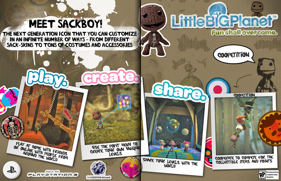
LANGUAGE:
This advert has included the title, caption, logo, game screen shots, console logo and images of the main character to make up the key codes and conventions of the ad.The slogan of the advert, "Play. Create. Share." is short yet very catchy and really sums the game very well. The way the language has been presented gives an effect that the game is entertaining and adventurous due to the fact that the advert is packed with info yet, in a very well presented manner.
INSTITUTION:
The game was originally created by a company called media molecule and then it was later published by Sony computer entertainment. Its available to play on a number of play station platforms such as; the PlayStation 3 (PS3), PlayStation Portable (PSP) and the PlayStation vita (PSV) however the platform of origin was originally the PS3. Both the company's behind the game are multinationals, meaning they are massive institutions.
AUDIENCE:
The game is rated a 7+ therefore i believe its mainly aimed at kids from the age of 7 to the age of 12. Although the game is highly popular for teenagers up to the age of 16. I think the game would be targeted at an audience of a mixed gender as the game advert has aspects for girls and boys therefore, it would attract a mix of both genders. However, i do believe that it may appeal to females slightly more due to the lack of action (as males tend to prefer more action-packed games).
REPRESENTATION:
The advert is presented well as it includes the slogan, logo, characters, etc. This really gives you a rough idea of what the game is about. Based on the way the advert has been presented, you can tell its mainly aimed at the younger generation. Also judging by the colours on the advert, it seems that there is alot of pink and this would therefore attract girls more as pink is quite a feminine colour. However on the advert & the game all characters are cartoons, and if you notice, none of the characters are categorized in genders. This could mean its not aimed at any particular gender.
Ana :)
Friday, 6 September 2013
Summer video game project- Assassins Creed 3
Hey
Blogger!
This is my new blogger account as i forgot the details of my old one but, from now on all media blogger updates will be on this account,
anyways...
So
its nearly the end of summer and i thought it would be a good idea to finally
make a start on my media studies
project -seeing as ive been away through out the WHOLE summer holiday!
For
this blogger update, ive been asked to do a project on a video game of my
choice.
I've
had to think long and hard on what game i should do my project on but with the
help of my "video-game obsessed" brother (as i dont particularly
prefer video games) i finally came to a conclusion and decided to do this
project on the video game "Assassins creed 3" -as its one of the only
video games that actually interest me along with the rest of the assassins creed
series.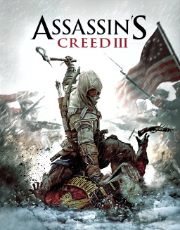
The brief story line of the game is about an assassin named Connor Kenway who is in the middle of the American Revolutionary War. Connor is fighting his own battle, which crosses with the events of the Revolutionary War. Because Connor was focusing on fighting against the British, instead some British characters are portrayed as good while some are characterized as bad. The game explores the confusing "grey area" between the Assassins and the Templars, rather than simply saying one half is good and other is bad.
The
Assassins creed series consists of the following video games:
·
Assassin's Creed (
Altair )-
Platform-
X Box 360, Play station 3, Microsoft Windows
Release
date- November 13, 2007
Current
Price- £10-15
No.
of copies sold- 4,677,000
·
Assassin's Creed II
( Ezio )
Platform-
X Box 360, Play station 3, Microsoft Windows
Release
date- November 17, 2009
Current
Price- £16
No.
of copies sold- 8,070,000
·
Assassin's Creed
Brotherhood ( Ezio )
Platform-
X Box 360, Play station 3, Microsoft Windows, Macintosh
Release
date- November 16, 2010
Current
Price- £20-25
No.
of copies sold- 6.5 million
·
Assassin's Creed Revelations ( Ezio )
Platform-
X Box 360, Play station 3, Microsoft Windows
Release
date- November 15, 2011
Current
Price- £15
No.
of copies sold- 7 million
·
Assassin's Creed 3 (
Connor )
·
Assassin's Creed 4
Black Flag ( Edward )
Platform- PlayStation 3, Wii U & Xbox 360,
Release
date- October 29, 2013 release in North America, October 31, 2013 release for
Australia, European release on November
1, 2013 and a Japanese release on November 28, 2013.
Current
Price- £43-61 (to pre-order)
No. of copies sold- still waiting to be released
The
genres of Assassins Creed 3 are
historical/action/adventure and its a third person shooter. It also is an open
world stealth game, which means the main player can move around freely in an
open virtual world but the player must avoid being caught by the enemy. These
types of games usually come under the action/adventure genre.
The game was released on the 30th
of October 2012 which means its only
been out for just under a year and in that short amount of time its sold
over 12 milllion copies worldwide.
The
game was developed by Ubisoft Montreal and published by Ubisoft.
The platforms of this game are Play station 3, Xbox 360, Wii U & Microsoft windows and its currently being sold at £18-£25.


The
way assassins creed 3 has been promoted has obviously been successful due to
the astonishing number of copies sold in just under a year.
Assassins
Creed has its own twitter & facebook page to update gamers and fans and
promote the games from the assassins creed series (including assassins creed
3). It also has a youtube channel where they update it with trailers and clips
from the game.

Facebook
page:

Youtube
channel:

The
way all the social networking sites have presented the pages to promote the
game, really appeal to gamers who are interested in action/adventure games
because on every site they have put dark yet adventrous colours such as khaki,
orange, and navy blue and also each site shows an assassin warrior, usually a
different character for each new game that’s released, depending on who is the
main player.
Also
to promote the game & to give gamers an insight ubisoft made a trailer of
the game (link & video below).
Another way ubisoft promoted the game was by making a short demo available
for people to download for free on their consoles. The demo was a success as it
lead to people buying it more.
This game is categorized an 18+ and the target audience would mainly be men with a percentage of approximately 70%. The remaining 30% would be a female audience. I believe the majority of the viewers are men because they are usually more interested in action and violent games. However the game is also set in a historical period which may attract the female population and it doesn’t include too much gore and blood.
This game is categorized an 18+ and the target audience would mainly be men with a percentage of approximately 70%. The remaining 30% would be a female audience. I believe the majority of the viewers are men because they are usually more interested in action and violent games. However the game is also set in a historical period which may attract the female population and it doesn’t include too much gore and blood.
To conclude, I personally think that the game was overall successful as the way ubisoft promoted it was excellent and it’s available on the three main consoles people own and it sold at quite a reasonable price.
Thats it from me bloggers, byeeeeeee x
Thats it from me bloggers, byeeeeeee x
Photoshop
Intro to Photoshop…
Hiya!
So today
we started looking at the software "Photoshop". To begin with i found
the software very complicated and hard to use! However after receiving help
from fellow students and teachers who were familiar with photoshop i started to
get the hang of it and it all became clearer.
As i
became more familiar with photoshop i began designing my own advert which was
aimed at promoting a bank. During the lesson i worked very well and managed to
produce 2 designs for an advert, one of which contained 3 different pictures
interpreting 1 word and another containing 1 picture that represented 3
different words.
The
adverts needed to have an association with the HSBC slogan "The more you
look into the world, the more you recognise what really matters to people"
My first
advert shows how different people have a different reason for smoking. It has 3
of the same images (Somone smoking a cigarette) and has 3 different words
describing each one. Addiction, Enjoyment and Anxiety are the words i have
chosed to describe the picture.
- I chose anxiety because some
people smoke for a very sad and more understandable reason which is when
they are depressed or upset.
- I also chose Addiction because
some people only smoke because they are very interigued by cigarettes and
they are addicted to it which means they cant stop because addiction is
usually uncontrollable.
- Finally, i chose enjoyment to
describe the picture as some people only smoke for the pleasure and
excitment or they do it to fit in which therefore makes them enjoy it!
Here it
is:

My second
ad is on how different people view teenagers. This advert has 3 different
pictures represented by one word. The word represtenting the images is
"teenagers". The three images i have included is a group of
intellectual teenagers, a teenage gang & a group of african teenagers
fetching water.
- I chose a group of
intellectual looking teenagers as the public have developed a sterotypical
veiw that all teenagers are either trouble or in gangs. Therefore i have
chosen a image that is completely the opposite of that view to show that
not all teenagers are troubled and that there are people out there who DO
think positivly about them.
- I have chosen to put an image
of a gang on my advert as it is the most common sterotypical veiw people
have on teenagers however it deffinatly shows the reality of what some
teenagers ARE actually like.
- On the other hand, my
last picture represents teenagers in a totally different way because
people usually forget that there are teenagers out there struggling in
poverty and have very little access to things as little and simple as
water (as shown in the picture).
Here it
is:

So, hope
you enjoyed reading this!
Bye
bloggers, until next time!
Ana
:)
"Hunger Games: Training" -Game Promotion
"Hunger
Games: Training" -Game Promotion
Hey
everyoneeeee!
In our
third Media session we did a project on creating a video game promotion. We had
to create a promotion for a new game called "The hunger games:
Training". During the process of designing the game promotion I believe that my group (Me,
Radhika, Manita & Sara) worked very efficiently and gave out the roles
effectively depending on who suited which role best. Additionally, this helped
us tackle the task very quickly and effectively. In my opinion it was
"easy-peasy!" :)
During the
task Radhika took the role of Account manager, Sara took the role of Finance
director, Manita took the role of Creative ideas director and I took the role
of Art director as i enjoy designing. Overall as a group we spent our money
very well as we didn't go over the budget and only spent 920,000 out of a
whopping 1,000,000!
As I took
on the role of the art director i had to make sure that i created a catchy logo
& cover for the game in order to promote it well. Luckily, me and Radhika
succeeded in doing so. We created a logo, slogan & game cover that we
believe would attract a lot of good attention and help the game sell.
Here it
is:

^^^
Game
cover!
In the
game cover i have included the slogan "Never let the fear of striking keep
you from playing the game...". I chose to put it there as it would
persuade the customer to buy it as it is catchy. I also put the logos of the
game consoles it can be played on and the age range because its important that
the customer knows if the game is suitable for them.

^^^
The logo!
In the
logo we included a bow and arrow because its the main weapon used in the hunger
games and it symbolises both the book, movie, and the upcoming game. We also
put in fire flames as fire usually connotes action and therefore makes the
buyer know that the game is action packed & full of adventure!
After completing this task i think i have learnt more about game promotion & its given me an insight on what we may be doing next year. It has made me very excited on what fun tasks, like this one, that i will be asked to produce in the next upcoming school year!
Bye...For
Now!
Ana :)
Textual analysis: Pompeii- Bastille (Music video)
Textual
analysis: Pompeii- Bastille (Music video)
Hey
everyone!
Today I'm
analysing the music video of "Pompeii" which is sung & written by
one of my favourite bands "Bastille"
I chose
this music video mainly because i am very interested in the music genre but
also because the music video of this song has a story behind it. In the music
video Dan is escaping from the people with black eyes, Who were probably
interpreting supernatural demons in the video. Then when he is in his car, he
discovers that he's becoming a ''demon'' too so he doesn't know what to do. It
is also based on how the volcano eruption destroyed the town pompeii and the
song raises awareness on how people are still destroying towns however they are
doing it by littering and building lots
of new buildings rather than keeping the town in its own natural form (as you
can see in the video). He is basically asking how we fix this? "Where do I
start, with myself, or the mess around me?" He then ends up in a desert
and the video ends there. To find out how the story goes on, watch their
''Flaws'' video which is the continuation of Pompeii.
Genre:
The clip I
have chosen is a music video.
The music
genre of this song is Pop/Rock
Audience:
The age
group of the target audience is mainly 15-25 year olds.
I think it
would suit this age range because pop & rock music is one of the most
common music genres that people from the age of 15 to 25 would listen to.
The
percentage of male audience is probably 60% because rock music is more
appealing to the male gender than the female gender.
Therefore
the other 40% would be the female audience .
The clip
is mainly aimed at the fans of the group but also people interested in pop/rock
music.
Platform:
The music
video of this song could be seen on:
MTV,
Television,
Youtube.
Phone.
Subscribe to:
Posts (Atom)